
Q&A with Stephanie McClelland, Design Director
–What is your favorite way to use the color gray in a room?
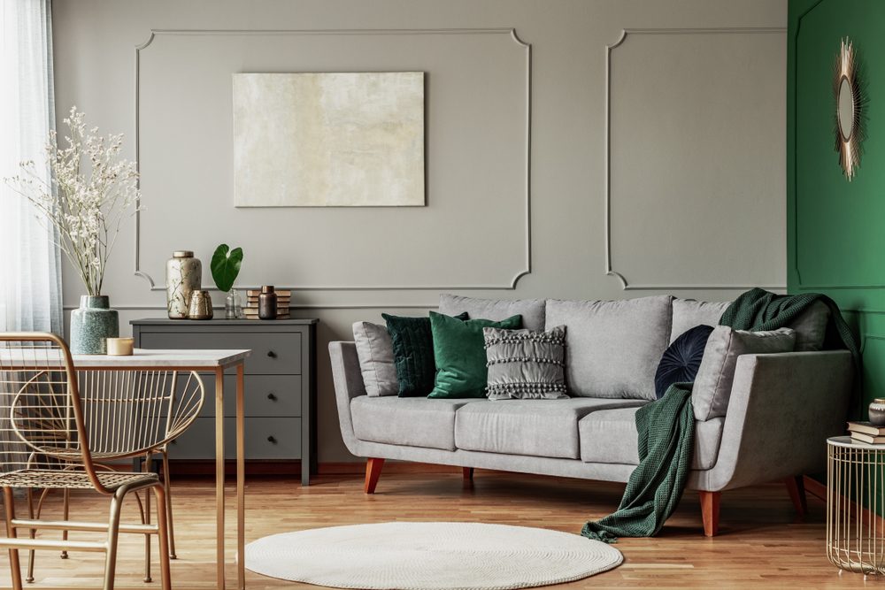
Paint as the primary backdrop in a room is my preferred use of gray. The spectrum of gray from very light and airy to dark and earthy provides a great deal of versatility and has had an ever evolving presence in design. Deep, rich grays, offer an excellent alternative to the boldness of black. While light, soft grays, are a subtle deviation from white and beige.
-What are your top tips for decorating with gray?
To avoid an environment feeling too cold or moody, take into consideration the addition of textures and patterns in the accoutrement and furnishings. These elements can both soften and liven up a room when layered against a neutral, gray background.
-What are some things someone may want to avoid when decorating a gray room?
When decorating with a gray it is important to account for the light levels within a room; both ambient and accent. The more inherently dark a space is, the darker any color will render; especially gray tones. Being mindful of the lighting, in both its efficacy and color temperature, will help in determining the best shade of gray for your space.
-Is gray a popular color? Is it trending?
Gray is a wonderful color and makes for a fantastic canvas for interiors. It is a neutral, much like beige or white, and is complementary to many hues. The past year has seen the dial, on this popular neutral, adjust and fall within the Greige family; which is a combination of, quite simply, gray and beige.
The temperature of greige shifts from warm (with red/beige undertones) to cool (with blue/gray undertones) and can easily be adjusted to one’s liking, which makes it an easy and attractive choice.